 Rupture Process of
the 2011
off the Pacific Coast of Tohoku Earthquake
(Mw 9.0)
as Imaged with Back-Projection of Teleseismic P-waves
Dun Wang and Jim Mori
(Earth, Planets and Space, 63, 603-607, doi:10.5047/eps.2011.05.029, 2011)
P
waveforms from 414 USArray stations were used in a
back projection analyses of the rupture for the March 11, 2011 Tohoku, Japan
earthquake. The stations in the US are at distances of about 7100 to 10200 km
(64 to 92 degrees) from the earthquake.
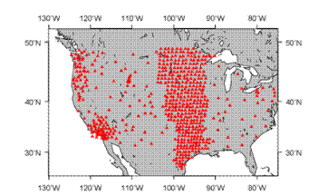
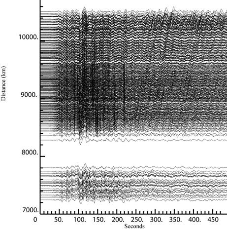

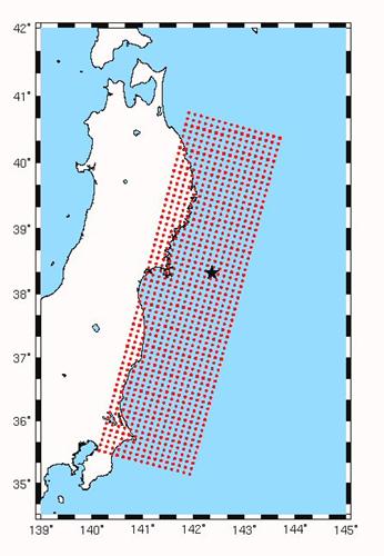
Figure 2. Grid of source locations
tested for each time window.
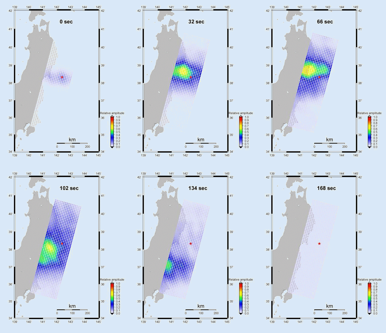
The left portion of Figure 4 shows
the spatial progression of the rupture, as inferred from the location of the
maximum correlation. The dots are the position for each 2 sec time point. The
right portion of Figure 4 shows the position distance as a
function of time.. In the top portion for the first part of the rupture, the
reference position corresponding to 0 time is the epicenter. In the bottom part
of the figure, the reference position is the northern most point of the second
part of the rupture.
One can see that the rupture moves toward the
northwest and downdip at a relative slow at a speed of about 1.0 to
1.5 km for the first 70 sec. Following that, the rupture propagates to the
southwest at normal speed of about 2.5 to 3 km/sec.
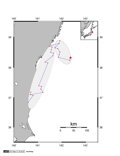
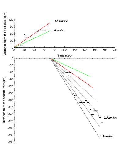
Figure 4. Left: The spatial progression of the
rupture from the back-projection analysis. Right: The rupture speed for the first 70 sec
is 1.0 to 1.5 km/sec. The speed for
the second section is 2.5 to 3.0 km/sec.
We also show the results of using
different frequency bands. We carried out the back-projection analyses using
data which was high-passed filtered at 1 hz (green),
band-passed filtered between 0.2 and 1.0 hz (brown)
and low-passed filtered at 0,2 hz
(blue). Figure 5 below shows that
for the lower frequency data, the locations of the inferred sources moves more toward trenchward (updip). The lowest frequency data shows sources that are trenchward of the epicenter. This is generally consistent with finite
fault models which show that there is a large amount of slip on the shallow
portion of the fault plane.
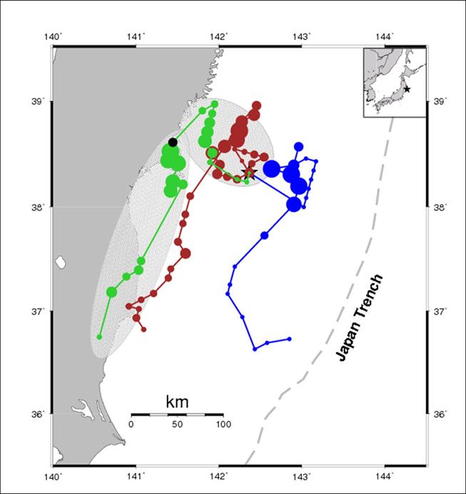
Figure 5. Sources of radiation for
data high-passed filtered at 1 hz
(green), band-passed filtered between 0.2 and 1.0 hz
(brown) and low-passed filtered at 0.2 hz (blue).